Creating a peaceful and relaxing atmosphere in your home starts with the colors you choose for your walls, furniture, and accessories. Calm colors have the power to soothe the mind, reduce stress, and make your living spaces feel welcoming and restful. If you’re looking to bring more tranquility into your home, selecting the right calm colors is an essential first step.
In this post, we’ll explore practical tips for choosing calm colors that work well together and suit your personal style. Whether you’re painting a single room or your entire home, these guidelines will help you make thoughtful choices to create a space that feels just right.
Why Choose Calm Colors?
Calm colors are hues that tend to evoke feelings of relaxation and comfort. Unlike bright, bold colors that can energize or stimulate, calm colors encourage a sense of peace and quiet. This makes them perfect for bedrooms, living rooms, bathrooms, or any space where you want to unwind.
Some common calm color families include:
– Soft blues and greens
– Warm neutrals like beige and taupe
– Muted lavenders and greys
– Gentle pastels such as blush pink or pale peach
By intentionally choosing these colors, you foster an environment that supports relaxation and mental clarity.
Tips for Choosing the Right Calm Colors for Your Home
1. Consider the Mood You Want to Create
Start by thinking about how you want the room to feel. Calm colors can range from cool and refreshing to warm and cozy. For example:
– Cool tones like blues and greens evoke nature and freshness.
– Warm tones like soft browns and pinks create intimacy and comfort.
Deciding on the mood will guide your color selection and help ensure your space aligns with your preferences.
2. Use a Color Palette with a Balance of Tones
A successful calm color scheme usually includes a mix of:
– Primary calm color: The dominant hue on walls or major pieces.
– Complementary neutrals: Softer shades like off-white, cream, or light grey to balance intensity.
– Accent colors: Small pops of color in accessories, pillows, or artwork to add interest without overwhelming.
Choosing a harmonious palette will keep the space visually appealing and serene.
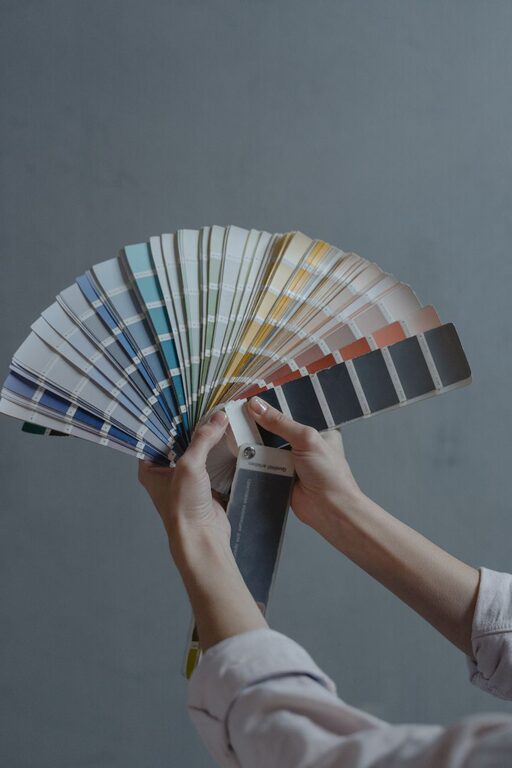
3. Test Colors in Natural Light
Lighting dramatically affects how colors look. A shade that appears calm and soft in store lighting might look dull or harsh in your home. To make a confident choice:
– Paint test patches on your walls.
– Observe the color at different times of day to see how natural light changes its appearance.
– Consider the room’s orientation (north-facing rooms tend to have cooler light, while south-facing rooms receive warmer light).
This step ensures your chosen colors feel calming throughout the day.
4. Draw Inspiration From Nature
Nature is an excellent source of calm color ideas. Think about the soothing colors you find outside:
– Ocean blues
– Forest greens
– Sandy beige
– Sunset pinks
Incorporating these natural tones can create a sense of harmony and connection to the outdoors.
5. Keep the Undertones in Mind
Colors have undertones, which are subtle hues beneath the surface color that influence how the shade feels. For calm colors, identify if:
– The undertone is cool (blue, green, or purple), which often feels more refreshing.
– The undertone is warm (yellow, red, or orange), which tends to create a richer, cozier atmosphere.
Matching undertones across your color choices helps maintain a cohesive and calming effect.
6. Avoid Overly Saturated Colors
Highly saturated colors can be visually intense and mentally stimulating, which is the opposite of calm. When selecting paint or fabrics, aim for muted, pastel, or softer versions of your favorite colors. These versions allow for relaxation without sacrificing personality.
7. Use Texture to Enhance Calmness
Color isn’t the only way to create calmness. Combining calm colors with soothing textures can add depth and softness to a room:
– Linen curtains
– Wool throw blankets
– Matte finishes instead of gloss
Textures complement your color choices by making the space feel cozy and inviting.
8. Think About the Room’s Purpose
Different rooms benefit from different calm color approaches:
– Bedrooms: Soft blues, lavenders, or greys promote restful sleep.
– Living rooms: Warm neutrals with cool accents create balance for socializing and relaxation.
– Bathrooms: Clean, fresh greens or light blues enhance a spa-like vibe.
– Home office: Soft, muted colors help maintain focus and reduce anxiety.
Tailoring colors to the function of each space maximizes their calming impact.
Color Combinations to Consider
Here are some popular calm color combinations that work well in many homes:
– Soft Blue + Warm Beige + Cream White
A classic combination that mixes cool and warm tones for a balanced, tranquil feel.
– Muted Sage Green + Stone Grey + Light Taupe
Inspired by earth tones, this palette brings nature indoors with subtle sophistication.
– Pale Lavender + Soft Grey + Blush Pink
A gentle, feminine palette that adds a touch of elegance and serenity.
– Dusty Rose + Warm White + Light Charcoal
Combines warmth with grounding neutrals for cozy calmness.
Final Thoughts
Choosing calm colors for your home is a rewarding project that can transform your environment and enhance your wellbeing. By considering mood, palette balance, lighting, and the room’s purpose, you can select colors that create a space where you feel relaxed and comfortable.
Remember to take your time experimenting with samples and test patches to find the perfect shades. With these tips in mind, you’re well on your way to designing a peaceful home filled with calm colors that reflect your style and make everyday living more enjoyable.